What Is a Good Body Fat Percentage? Your Scale’s Ranges Are Converted BMI

From the first sentence of the paper behind the “healthy” body fat ranges that bathroom scales and calculators print by sex and age: “no accepted published ranges of percentage body fat currently exist.” [1]
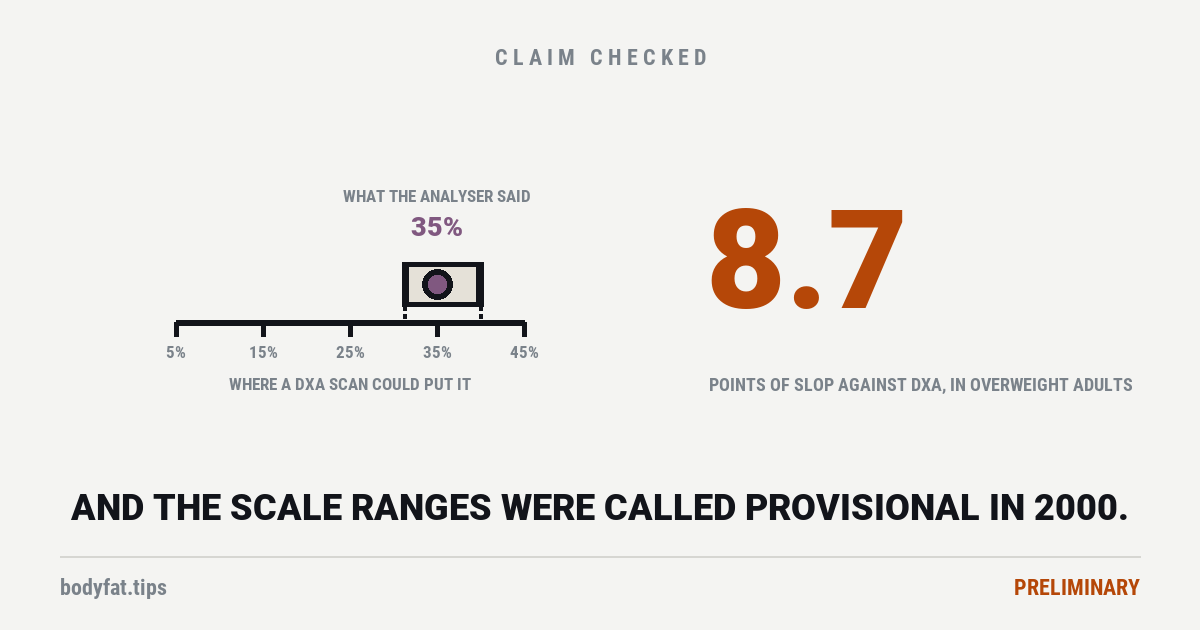
That was published in 2000. The ranges it went on to propose are the ones scale manuals and calculators have printed since, and the authors called them provisional — in their words, “the groundwork and stimulus for establishing international healthy body fat ranges.” [1]
Others carried on. Two of its own authors redid the sums in 2012 on a national US sample scanned by DXA, and their lines came out higher [5]. From 2003, researchers tied body fat lines to health itself: first to metabolic syndrome (the cluster of high blood pressure, high blood sugar, abnormal blood fats and a large waist), later to death [4] [6] [7]. What the work has not produced is agreement. The 2012 re-derivation opens by saying there was “no consensus regarding adult cutoffs”, and a 2026 study built for new international obesity criteria still calls body fat thresholds “limited” [5] [7]. The 2012 paper does note that two endocrinology bodies had suggested 25% for men and 35% for women as the line for obesity, and says there was no consensus all the same [5].
Where the numbers actually came from
The researchers measured body fat in 1,626 adults across three ethnic groups at three universities, using proper reference methods — a four-part body composition model and DXA scanning, not a bathroom scale. [1] That part is solid work.
Then look at how they turned it into ranges. They took the existing BMI cut-offs — underweight below 18.5, overweight at 25, obesity at 30 — and worked out what body fat percentage those corresponded to. [1]
So this body fat chart is a translation of the BMI chart. It is not built directly from anybody’s heart attacks, diabetes or death. It borrows the BMI lines, which rest on evidence tying BMI to disease and death, and converts them into body fat [1].
Which is worth knowing before you treat crossing one of those lines as a medical event.
The other chart is not from this paper. The one with rows for essential fat, athletes, fitness, average and obese, one column for each sex and no ages at all, has a different history. The earliest printings we found are from 2003: in a US fitness-certification body’s trainer manual and, with slightly different numbers, in a textbook of primary-care procedures [10]. By 2008 the same body’s weight-management manual called the bands “established” norms and credited its obese line to a 2002 paper on the economics of obesity; its website printed the chart from at least 2009, and its 2023 calculator page names no source [10]. We could not trace when it was first printed, or where its athlete and fitness bands come from. A fitness body’s chart is not a medical standard.
And what the copies leave out
The prediction in that paper depends on four inputs: your BMI, your sex, your age, and your ethnic group. [1]
The copies we read keep its sex and its three age bands, and leave out the word provisional, the separate table for Asian adults, and how loosely the prediction fitted: even with all four inputs, a person’s measured body fat sat a typical 2.8 to 5.4 percentage points from the value the equations predicted for them. That spread, the standard error of the estimate, is why a body fat reading and BMI can file the same person differently. The authors’ own warning was narrower: their underweight lines rest on very few people and “should be applied cautiously.” [1]
Then there is whatever you measured yourself with
| The ranges | On scales, BMI cut-offs converted into body fat rather than drawn directly from health outcomes, and called provisional by the authors who built them. [1] On fitness pages, bands we could not trace to a source. [10] |
| The prediction | People’s measured body fat sat a typical 2.8 to 5.4 percentage points from what the equations predicted from their BMI, sex, age and ethnic group. The copies keep sex and age, and drop that spread. [1] |
| Your measurement | In 48 overweight or obese adults, a good body-composition analyser sat between 5.0 points below and 3.7 above DXA. Its authors recommend it for groups, not individuals. [2] Bathroom scales have their own verdict. |
That third row is the one people underestimate. A multi-frequency body-composition analyser — a good one, not a cheap bathroom scale — was compared against DXA in 48 overweight or obese adults aged 30 to 50, all in one country, Colombia. The correlation was strong, 0.921. [2]
But the limits of agreement, the band that held the gap between the two machines for 19 people in 20, ran from 5.0 points below DXA to 3.7 above. [2] The analyser read slightly low on average, so the band runs further above a reading than below it. Take a reading of 35%, inside the range those 48 people covered: by our arithmetic from those limits, a DXA scan could have put that person anywhere from about 31% to about 40%. The study cannot say how far out the analyser is for someone leaner. Its leanest group, five men, averaged 28.8% on DXA, and the band was wider in the overweight half of the sample than in the obese half, 6.0 points below to 4.0 above [2]. The authors’ own conclusion is that the method can be recommended “for groups of populations” — not for one person. [2]
That is a study of 48 people and we are not going to oversell it. But it points the same way as the arithmetic above: the number is softer than the display on the device implies.
Does the number predict anything at all?
Yes — and here the honest answer gets more complicated than either side of this argument usually admits.
A study of 500,107 UK adults followed for over a decade found every measure of body fat positively associated with getting a chronic disease — cardiovascular disease, diabetes, several cancers, osteoarthritis. [3] Carrying more fat tracked with getting more ill. That part is not in dispute here.
Mortality was a different story. Body fat in that cohort was a bioimpedance reading (a small electrical current sent through the body), the technology in the analyser above. After full statistical adjustment, only waist-to-hip ratio stayed linked to a higher risk of dying. Body fat percentage and BMI ran the other way: more of either went with a lower risk. [3]
We are going to be careful with that, and you should be too. The authors offer it as support for a hypothesis, not as a finding to act on: that body fat “may be protective against death”, and that the extra risk of a high waist-to-hip ratio may come from “something other than body fat” [3]. They take on the obvious objection, that adjusting for things that sit between fat and death distorts the answer, and reply that such over-adjustment pulls a result towards zero, not past it. Without waist-to-hip ratio in their model, more body fat went with higher risk in men and slightly lower risk in women; with it, lower risk in both [3]. A 2022 pooling of 35 cohort studies points the other way on average: in the 11 that measured body fat percentage in general adult populations, every 10 points more went with about 11% more risk of dying, with no clear link in people over 60 [9]. It also found the link weaker in studies that adjusted for those in-between factors, which its authors read as over-adjustment in some of them [9]. The UK result also comes from one cohort, 94.7% white, aged 40 to 69. This is the kind of result we flag rather than repeat.
What survives all of that is narrower and more useful, and this part is our reading rather than any one paper’s finding: where the fat sits appears to matter more than what the total says. In the UK cohort, a tape measure round your waist and hips tracked the risk of death where a body fat percentage did not [3], and in the 2022 pooling, fat stored deep in the belly went with higher risk while fat under the skin went with lower [9]. The UK authors’ own caution points elsewhere: they think the waist-to-hip signal may not be about fat at all, and their scans of deep belly fat showed no particular advantage, in an analysis they call underpowered. [3]
So what is a good body fat percentage?
Nobody can hand you one number that holds for everyone, and the people who built the scale ranges said none existed before they proposed theirs. That is not us dodging the question — it is the answer. Studies that tie body fat to health put their lines in different places. In US national survey data, the obesity line drawn from metabolic syndrome or from death sits at about 28 to 30 percent body fat for men and 37 to 40 percent for women [4] [6]; in 18,254 Korean adults it sat at 27.8 and 39.5 percent [7]. Those are risk lines measured in particular people with particular machines, not targets. A 2025 international commission on clinical obesity now asks doctors to confirm excess fat by direct measurement where they can, or with a tape measure, “using validated methods and cutoff points appropriate to age, gender, and ethnicity” [8]. The ranges in the scale manuals we read come from the 2000 paper, not from any of these.
What to do instead, given all three layers of slop:
— Use your own trend, not the category, and read it gently. A home reading’s error is not a fixed offset that cancels out when you compare yourself with yourself; it moves with body size and with how much water you are carrying. Our verdict on body fat scales found the most they support: same device, same conditions, months rather than weeks, and ignore moves under about five points, because in a 2023 test of fifteen devices the band around one person’s measured change ran from plus or minus 3.4 to 5.2 points.
— Measure the same way every time. Same device, same time of day, same hydration. Switching methods produces a change that is not a change.
— A tape measure is not a downgrade. In the largest single cohort here, waist-to-hip ratio outperformed body fat percentage for the outcome people care most about. [3]
And the thing charts are actually used for is not health. Most people looking up a target are looking up how they want to look, which is a legitimate thing to want and a different question from whether a number is healthy. It is worth being honest with yourself about which one you are asking, because only one of them is a question about health.
Related: a pound of muscle and a pound of fat weigh the same, and the difference is volume, you cannot choose where it comes off, telling remaining fat from loose skin, and why the calorie arithmetic stops working after a few months. For two measurements with outcome data of their own, see fitness and grip strength.
This page’s history of the chart, its claim that nobody followed up the 2000 ranges, and its worked example were corrected on 9 October 2026 after an independent editorial review. We said every body fat chart traces back to the 2000 paper. The age-banded ranges on bathroom scales and calculators do; the other common chart, with rows for essential fat, athletes, fitness, average and obese, does not, and we could not trace its athlete and fitness bands to any source. We said nobody finished the work and that it was never replaced or replicated: two of the paper’s own authors re-derived the ranges from national US data in 2012, and lines tied to metabolic syndrome or death have been published since 2003, though none has become an agreed standard. And we said a 22% reading on a good analyser fits a real value of about 17 to 26. The analyser read low, so the band runs the other way, about 18 to 27, and 22% sat below everyone in that study of 48 overweight or obese adults, so the page now works the example at a reading inside it and says what the study cannot tell you.
Also changed: the standard error is now described as how far people sat from the equations’ prediction, not as a margin on the chart’s lines; the words quoted as the authors’ are now theirs; the UK cohort’s body fat is identified as a bioimpedance reading, its mortality result now says only waist-to-hip ratio stayed linked to a higher risk, and the authors’ hypothesis and their answer to the adjustment objection are reported, with a 2022 meta-analysis of cohort studies beside them; “where the fat sits” is labelled as our reading; the advice on tracking your own trend now matches our verdict on scales, which is linked; the funding row, which said funding was not stated, now reports each source, including a scale maker’s donation to the 2003 study; the suggested line the 2012 paper records, 25% for men and 35% for women from two endocrinology bodies, is now reported; the search figure counts only chart and target searches, and says where it came from and when we pulled it; and the title and search description changed with the text. The rating is unchanged. Its stated reason, that the foundational work had never been superseded, was wrong; the reason now is that the lines tied to health disagree across populations and are not the charts people are given.
Corrected again on 9 October 2026, after our verdict on body fat scales was corrected the same afternoon. This morning’s correction brought this page’s advice on tracking your own trend into line with that verdict, which then said to ignore moves under two or three points. The verdict now weighs a 2023 test of fifteen devices, in which the band around one person’s measured change in body fat ran from plus or minus 3.4 to 5.2 points, and says to ignore moves under about five. This page now says the same. Nothing else on this page changed, and the rating is unchanged.