VO2 Max by Age: The Real Numbers — and Why a Bike Test Reads Lower

Here are the numbers, and then the three things that move your place on them before you have done a single session.
The American reference standard for VO2 max comes from the FRIEND registry: 22,379 tests, 34 laboratories, every state except Alaska, Nebraska and Wyoming, all of them measured properly — mask, treadmill or bike, increasing difficulty until the person could not continue. [1]
VO2 max is the most oxygen your body can take in and use in a minute, per kilogram you weigh, flat out. It is written in mL/kg/min and there is no everyday American unit for it, so it stays as the researchers write it.
The table
| Percentile | 20–29 | 30–39 | 40–49 | 50–59 | 60–69 | 70–79 | 80–89 |
| 90th | 58.6 | 55.5 | 50.8 | 43.4 | 37.1 | 29.4 | 22.8 |
| 50th | 46.5 | 39.7 | 35.3 | 29.2 | 24.6 | 20.6 | 17.6 |
| 10th | 28.6 | 24.9 | 22.1 | 18.6 | 15.8 | 13.6 | 12.9 |
| Percentile | 20–29 | 30–39 | 40–49 | 50–59 | 60–69 | 70–79 | 80–89 |
| 90th | 49.0 | 42.1 | 37.8 | 32.4 | 27.3 | 22.8 | 20.8 |
| 50th | 36.6 | 28.3 | 25.7 | 22.9 | 19.6 | 17.2 | 15.4 |
| 10th | 22.5 | 18.6 | 17.2 | 16.5 | 13.4 | 12.3 | 11.4 |
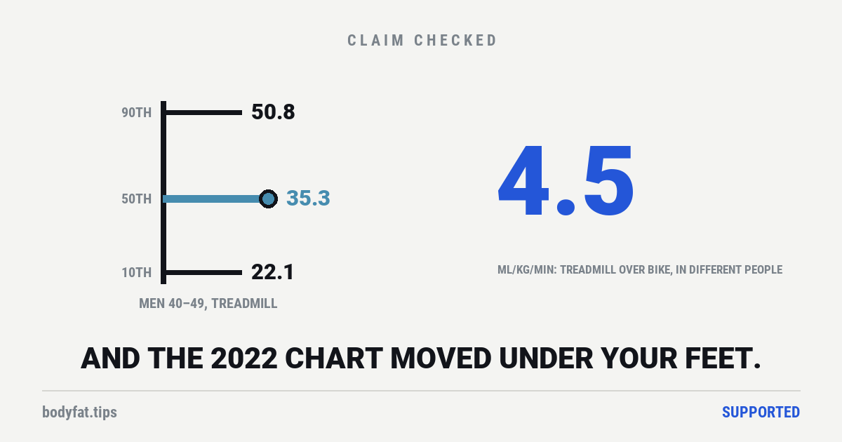
Find your row, find your decade. The 50th percentile is the ordinary middle — half of the people tested came in above it and half below. The 90th and 10th are there so you can see the spread, which is wide: among men in their forties, the top tenth start at 50.8 and the bottom tenth finish at 22.1. [1]
That is the answer to the question. Now the part no chart tells you.
1. Which machine you were on
In the registry, treadmill tests averaged 22%, or 4.5 mL/kg/min, higher than bike tests. [1] But those were different people, and the people tested on bikes were heavier for their height in 13 of the 14 age-and-sex groups (our count, from the paper’s first table). The score is divided by body weight, so extra weight can pull it down: the 4.5 mixes the machine with who happened to be tested on it. For the machine itself, the American Heart Association’s 2016 statement puts a bike test 10% to 20% lower than a treadmill test in untrained people. [3]
So a bike-derived number read against a treadmill chart understates you, by roughly as much as a hard training block is worth. In trials of adults aged 18 to 45, a few months of intervals added about 5.5; older adults gain less. Reading the wrong column can cost you the whole thing on paper.
The tables above are treadmill values. If you were tested on a bike, the paper has a separate set and you want those.
2. Which edition of the chart you found
This is the one that surprised us, and we checked it by putting the two published tables side by side rather than taking a sentence on trust.
| 50th percentile | 2015 | 2022 | Change |
| Men 20–29 | 48.0 | 46.5 | −1.5 |
| Men 70–79 | 24.4 | 20.6 | −3.8 |
| Women 20–29 | 37.6 | 36.6 | −1.0 |
| Women 70–79 | 18.3 | 17.2 | −1.1 |
The standard moved down. A man in his seventies who scored 22 was below the middle on the 2015 chart and above it, just short of the 60th percentile, on the 2022 one. Same person, same lungs, different edition.
And here is the sentence that has to come with it, because leaving it out would manufacture a story that is not there. The authors say the drop is “unlikely to be due to decreases in CRF over the years” — rather, the newer values “may more accurately represent” the country. [1]
Look at why. The 2015 standard came from 8 laboratories and 7,783 treadmill tests. The 2022 one came from 34 laboratories and 22,379 tests, 16,278 of them on a treadmill. [1][2] On the authors’ reading, the chart moved because far more of the country got measured, not because the country got less fit. That is what a reference standard getting better looks like, and it is the opposite of the decline story the numbers could be made to tell. It is still not all of America, though: the registry holds people who were sent for a test, for a check-up, a fitness assessment or a research study, rather than a random sample. [1]
3. Whether anybody actually measured you
Every number above came off a gas analyser. The number on your wrist is a model — a guess assembled from your heart rate and your pace.
When one maker’s watch, running its newest VO2 max software at the time, was checked against treadmill tests run to a verified maximum in 35 young adults, it read 6.25 mL/kg/min low on average and put only 5 of the 35 in their right band of this chart; 18 were two bands or more out. [8] The volunteers were young and mostly very fit, which the authors name as the study’s main limit. An earlier test of an older model ran nineteen people, measured them on a bike to exhaustion rather than on a treadmill, and took the watch’s figure after one outdoor workout. Its reliability statistic came out at 0.47, which the authors classify as poor, though they judged its overall agreement, measured another way, good; and its root-mean-square error, an average of the misses that counts the big ones extra, was 8.85 mL/kg/min. [6] Its authors say that result cannot contradict the maker’s own accuracy claim, because by the maker’s account the estimate improves with more outdoor workouts.
Hold those misses against the table above. Among men in their forties, the 50th percentile and the 90th are 15.5 apart: the older study’s 8.85 is most of that distance, and the newer study’s average of 6.25 is about two fifths of it (our arithmetic). The sibling page goes through the watch evidence properly, including the fair defence of it. The short version for this page: do not put a wrist estimate into a chart built from gas analysers and believe the percentile that comes out.
Why anyone built these charts at all
In 1989 a study in JAMA followed healthy men and women and reported that low fitness predicted dying earlier. [4] The 2022 FRIEND paper opens by calling it “the seminal report”. [1]
The evidence since has become very large. A 2024 overview gathered 26 meta-analyses covering 199 cohort studies and 20.9 million observations, across 21 kinds of death and disease. [5] Across the analyses of death it gathered, the fittest groups’ risk came out 41% to 53% below the least fit groups’, and both ends of that range are for death from any cause. “Roughly half” is the top end, and it comes from one 2022 meta-analysis of 19 cohorts. [5] Those are ratios between groups followed for years, the fittest against the least fit; they are not anyone’s personal odds.
The normal ranges came before the vital-sign argument, not after it. Until 2015 the most widely used American reference values came from one clinic’s records, and they were estimated from treadmill speed and slope rather than measured. [2] A 2013 American Heart Association policy statement called for a national fitness registry; FRIEND was set up in 2014 in answer, and in 2015 it published the first American standards built from measured tests. [1][2] In 2016 the association went further, with a formal statement arguing that fitness should be treated as a clinical vital sign, one of the routine readings a clinic takes, like blood pressure; it cites those standards. [3] Nor is that statement why a watch shows you a number. By 2015 a study could describe heart-rate watches that score your aerobic fitness as popular with recreational and professional athletes, and it found that one maker’s score was driven mainly by how active the wearer said they were. [7]
The association is real and it is not a promise. Those cohorts compare fitter people with less fit people; the certainty the reviewers themselves attach to that evidence runs from very low to moderate, mainly because most of the studies included only men. [5] How we grade this kind of evidence.
What the chart cannot do
Four limits, all of them stated by the people who built it. [1]
— It is American. The authors say plainly that fitness differs between countries and that these values should be applied cautiously outside the US.
— “Apparently healthy” is doing some work. People with heart or blood-vessel disease, a past stroke or COPD (a lung disease) were excluded, but the authors note the remaining group still included people with diabetes, obesity and joint problems.
— The oldest band is thin. The 80–89 group is 358 people, 1.6% of the whole registry.
— The tests span 1968 to 2021. A current reference standard contains measurements taken more than fifty years apart.
None of that makes the table wrong. It makes it a reference, which is a different thing from a verdict on you.
What to do with your number
Two honest uses, and one bad one.
Useful: compare yourself to your own previous properly-measured number. And note which decade band you sit in, because the gap between bands averages about 4.0 — roughly what a training block moves.
Not useful: comparing your watch’s number to somebody else’s watch, or to a chart whose edition, machine and population you cannot name. That is three unknowns stacked on an estimate.
Fitness is a number measured about you that you can also change. Grip strength predicts a lot too, and squeezing a gripper moves the reading; we found no trial of grip training that set out to measure deaths or heart attacks. Training moves fitness, and the trials show it. So does the simplest version of doing more.
And the thing being sold is the measurement. The table above is free, the paper it came from is open access, and the part that actually changes your row is being out of breath on purpose, regularly.
Corrected on 30 September 2026. This page said grip strength predicts a lot “and squeezing a gripper does not fix it”, as if that had been tested. It has not: our grip strength verdict, corrected today after an independent editorial review, reports that the researchers asked for that trial and nobody has run it. The sentence now says so. Nothing else on this page changed.
Corrected again on 30 September 2026. Our earlier note today said the trial of whether squeezing a gripper lowers risk has not been run, and the sentence said nobody has tested it. That was broader than the search behind it. Our grip strength verdict, corrected a second time today, says what we can support: we found no trial of grip training that counted deaths or heart attacks (searched 30 September 2026), while trials of strength training in general have counted deaths and found no clear difference. The sentence now says we found no such trial. Nothing else on this page changed.
Corrected on 9 October 2026 after an independent editorial review. The page told the history of these charts backwards. It said the American Heart Association’s 2016 statement on fitness as a vital sign is why reference standards exist, and why a watch shows you a number. The first measured American standards came out in 2015, after a 2013 association policy statement called for a national registry; the 2016 statement cites them; and heart-rate watches were already scoring fitness before the 2016 statement. It also said both FRIEND papers open by citing the 1989 study; only the 2022 paper does. The funding row said the sources did not state their funding. Most of them do, and the 2016 statement’s authors disclose industry ties; the row now lists what each source says. And the page credited its “roughly half” death figure with an overview’s 199 cohorts and 20.9 million observations, which cover 21 kinds of death and disease. The figure comes from one meta-analysis of 19 cohorts; for death from any cause the overview’s estimates run from 41% to 53% lower; and its certainty rating is held down mainly because most of the studies included only men, not, as the evidence panel said, because the evidence is observational.
Also corrected: the headline said the same person scores 4.5 lower on a bike. The 4.5 is the registry’s average gap between different people, and its bike group was heavier for their height; the 2016 statement’s figure for the machine itself is 10% to 20% in untrained people, and the page now says so. The watch section called a root-mean-square error a typical error and did not say that study measured people on a bike after one outdoor workout; it now leads with a 2026 treadmill test in which the watch put 5 of 35 people in the right band of this chart. The page stated as fact what the authors offered as likely, that the 2022 chart moved because more of the country was measured; it now gives that as their reading and says who gets tested. Our second note of 30 September said the grip sentence had been narrowed; the sentence itself was not changed then, and is now. It says less than that note did, because a 2026 trial of grip exercise in people with advanced kidney disease recorded a death, as our grip strength verdict, corrected on 7 October, explains, and it no longer implies grip strength cannot be changed. The 5.5 that a few months of intervals adds came from trials of adults aged 18 to 45; older adults gain less, and the page now says so. The page also called the older test’s 0.47 an agreement statistic; its authors call it a reliability statistic, and judged overall agreement good. The rating is unchanged.